I have been going through the PERFORMANCE BLUES lately. My machine was grinding to a slow slog as it tried to use PHOTOSHOP, BRIDGE, LIGHTROOM and a couple of browsers at the same time. Shame on me for trying to do that with only 6GB of RAM. And I thought 6GB was a lot.
I caucused with folks at the APPLE GENIUS BAR and they showed that I needed to monitor FREE MEMORY in ACTIVITY MONITOR. I barely had any Free Memory showing (green area), which is key to performance. All it took was Firefox getting stuck on one FLASH webpage and it could bring the machine to its knees. I added 8GB and now with a total of 14GB, I am a happier camper. Windows folks will have a similar feature in Control Panel or similar "under the hood" utility.
Moral of the story: Max out your Memory in your machine if you use PHOTOSHOP, BRIDGE, LIGHTROOM or Apple Aperture if you don't want to waste time.
Here are the Halloween Cats, the latest from the EYES Gallery. Enjoy.
JA
Showing posts with label Photoshop. Show all posts
Tuesday, January 17, 2012
Wednesday, May 19, 2010
DECLARING WAR PART 2: ASPECT RATIOS
Resuming the discussion from yesterday, clearly the camera manufacturers, the printer manufacturers and the ancillary frame manufacturers and art world never break bread at the same table. In the sophisticated age of 2010, looking at the absolute chaos and mishmash of formats and Aspect Ratios, the physical photo landscape looks like:
MY vote is that 4 x 6, 6 x 9 and 8 x 12 OUGHT to be the 21st century standards of 1.5 to 1 ratio. There is a 2 inch increase as you go up the scale of the proportions: 4, 6, 8. These represent 80% of the worlds cameras see below from Wikipedia. The sizes of 5 x 7 and 8 x 10 need to go away forever.
Wikipedia entry:
As of 2008, DSLR sales are dominated by Canon's and Nikon's offerings. For 2007, Canon edged out Nikon with 41% of worldwide sales to the latter's 40%, followed by Sony and Olympus each with approximately 6% market share.[27] In the Japanese domestic market, Nikon captured 43.3% to Canon's 39.9%, with Pentax a distant third at 6.3%.[28]
D-SLR CAMERA SENSORS
Full Frame 35mm & APS-C = 1.5 x 1 = 4 x 6 print = 8 x 12 print = 6 x 9 print Most Canon & Nikon D-SLRs
APS-H = 1.81 x 1 (a few high-end, very high speed Canon models)
4/3 rds = 1.33 x 1 Olympus / Pentax
PHOTOS / FRAMES
4 x 6 Print 3:2 = 1.5 x 1 (See above)
5 x 7 Print = 1.4 x 1
6 x 9 Print - 1.5 x1
8 x 10 Print = 1.25 X 1
8.5 x 11 Print = 1.29 x 1
8 x 12 Print = 1.5 x 1
VIDEO
4/3 rds = 1.33 x 1 = Standard TV
16 x 9 = HDTV
MEDIUM FORMAT
1:1 = Square
Speaking of format, I highly recommend the book: Photographic Composition
by Grill & Scanlon.


For an offbeat look at format, Panoramic breaks all the rules. Click here for an example.
.
- Software printing preset sizes (Photoshop, Lightroom, et al.)
- Printer Paper sizes
- Frame sizes,
- Chip sensor sizes
- Backing material sizes and
- Mounting Adhesive sizes
MY vote is that 4 x 6, 6 x 9 and 8 x 12 OUGHT to be the 21st century standards of 1.5 to 1 ratio. There is a 2 inch increase as you go up the scale of the proportions: 4, 6, 8. These represent 80% of the worlds cameras see below from Wikipedia. The sizes of 5 x 7 and 8 x 10 need to go away forever.
Wikipedia entry:
As of 2008, DSLR sales are dominated by Canon's and Nikon's offerings. For 2007, Canon edged out Nikon with 41% of worldwide sales to the latter's 40%, followed by Sony and Olympus each with approximately 6% market share.[27] In the Japanese domestic market, Nikon captured 43.3% to Canon's 39.9%, with Pentax a distant third at 6.3%.[28]
COMMON ASPECT RATIOS
D-SLR CAMERA SENSORS
Full Frame 35mm & APS-C = 1.5 x 1 = 4 x 6 print = 8 x 12 print = 6 x 9 print Most Canon & Nikon D-SLRs
APS-H = 1.81 x 1 (a few high-end, very high speed Canon models)
4/3 rds = 1.33 x 1 Olympus / Pentax
PHOTOS / FRAMES
4 x 6 Print 3:2 = 1.5 x 1 (See above)
5 x 7 Print = 1.4 x 1
6 x 9 Print - 1.5 x1
8 x 10 Print = 1.25 X 1
8.5 x 11 Print = 1.29 x 1
8 x 12 Print = 1.5 x 1
VIDEO
4/3 rds = 1.33 x 1 = Standard TV
16 x 9 = HDTV
MEDIUM FORMAT
1:1 = Square
Speaking of format, I highly recommend the book: Photographic Composition
For an offbeat look at format, Panoramic breaks all the rules. Click here for an example.
.
Thursday, May 13, 2010
ADOBE PHOTOSHOP CS5 ANNOUNCED
Adobe says they are now shipping Adobe Photoshop CS5 but Amazon says they shipping May 25th. I am not sure when Adobe is actually putting the boxes in the mail.
This is major upgrade with the easy to use and controversial CONTENT AWARE FILL feature. This is a powerful new feature that makes editing faster and smarter. The downside is that it has lots of implications for retouching such as EASILY removing your watermark from photos you want to protect.
At the recent NAPP seminar at Javitz Convention center, they told us that Noise reduction in Camera Raw is improved and hopefully we will not have to rely on plug-ins like Noise Ninja. This improvement will also affect the performance of Lightroom as it uses Camera Raw as its processing engine too.
There is improved full HDR functionality, so Photomatix may no longer be necessary For the HDR crowd. Adobe giveth, Adobe taketh away. And, so cool, there is now a mini-Bridge built into Photoshop.
In addition to new features, Adobe put their development team to attack over three dozen "annoyances" or fixes.
Click here for the Abobe site for CS5 Adobe upgrade is $199, full version $699
Note there is a Student and Teacher edition for $199 at Amazon if you meet their criteria. This has ALL the features of the regular version.
Windows
Student & Teacher Version
Mac
Student & Teacher Version
Ugrades from Amazon are $191. You can upgrade from the following versions:
Windows Upgrade
Mac Upgrade
Full Version from Amazon is $661.
Windows
Full Version
Mac
Full Version
Check out my fine art gallery which was made possible by Photoshop.
.
This is major upgrade with the easy to use and controversial CONTENT AWARE FILL feature. This is a powerful new feature that makes editing faster and smarter. The downside is that it has lots of implications for retouching such as EASILY removing your watermark from photos you want to protect.
At the recent NAPP seminar at Javitz Convention center, they told us that Noise reduction in Camera Raw is improved and hopefully we will not have to rely on plug-ins like Noise Ninja. This improvement will also affect the performance of Lightroom as it uses Camera Raw as its processing engine too.
There is improved full HDR functionality, so Photomatix may no longer be necessary For the HDR crowd. Adobe giveth, Adobe taketh away. And, so cool, there is now a mini-Bridge built into Photoshop.
In addition to new features, Adobe put their development team to attack over three dozen "annoyances" or fixes.
Click here for the Abobe site for CS5 Adobe upgrade is $199, full version $699
Note there is a Student and Teacher edition for $199 at Amazon if you meet their criteria. This has ALL the features of the regular version.
Windows
Mac
Ugrades from Amazon are $191. You can upgrade from the following versions:
- Photoshop CS2, CS3, & CS4
- Photoshop CS3 & CS4 Extended
Windows Upgrade
Mac Upgrade
Full Version from Amazon is $661.
Windows
Mac
Check out my fine art gallery which was made possible by Photoshop.
.
Labels:
Adobe,
content aware fill,
CS5,
digital photography,
fine art photography,
NAPP,
Photoshop
Wednesday, March 24, 2010
ADOBE LIGHTROOM 3.0 BETA 2 Released
I am very excited about this one. The Lightroom BETA 2 is here with VIDEO SUPPORT! The Beta Ver 1 had improved Watermarking capability, but this is great now that it recognizes Videos. You can not use the develop module at the moment, but in Library Mode, you can do keywording and other Metadata tasks. FINALLY! Thank you Adobe.
In addition, there is now:
- DIRECT TETHERED CAPTURE for select Canon and Nikon cameras
- Point Curve behavior like Photoshop Curves on the Tone Curve
- Improved Noise Reduction with Luminance added
- Improved Watermark formatting
You can upgrade the Catalog you had been using in BETA 1 (Not your production Catalog)
The 11 min video below is really good.
Click here to see the Adobe Video on what's new.
Click here for the download.
Labels:
beta,
lightroom 3,
lightroom 3 beta 2,
photography,
Photoshop,
workflow
Tuesday, February 9, 2010
INTERMEDIATE PHOTOSHOP: Converting Color Negatives
There are many methods to convert scans of Color Negatives to Positives. Some work better than others. I work extensively in Adobe Lightroom and have not been happy with the results of the plug-ins I have tried for that program. Here is a relatively simple, quality method that relies on your ability to do basic color correction and cleanup in Photoshop. CS4 is used here and must be done on one image at a time. Notes are made for Photoshop Elements Users, I have Version 6.0 on the Mac. More methods will be discussed in subsequent posts.

This is a surface shot of boats in Los Islotes, Mexico. BE RESPONSIBLE FOR YOURSELF. ALWAYS TRY EDITS ON A DUPLICATE IMAGE. NEVER TRY NEW EDITING TECHNIQUES ON YOUR ONLY COPY. PHOTOSHOP unlike Lightroom IS DESIGNED FOR DESTRUCTIVE EDITING AND CHANGES PIXELS.
1. Load your image in Photoshop and go to CURVES (Mac: Command + M; Win: Ctrl + M).
1A. For Photoshop Elements Users: Load your Image and go to LEVELS (Mac: Command + L; Win: Ctrl + L).
2. Select the White Point Dropper inside the green circle on the right, as shown above.
3. Click on a "likely" white object in your scene as shown in the left hand green circle, and click OK to close.
This may be tricky to find the correct spot, so be patient, this is an art not a science. You may need to cancel and do this a number of times until you get an image below that is fairly close to what you expect. You are essentially picking a spot that will tell Photoshop how to remove the orange mask in the Negative. As this is not an automated action, the film stock/mask (Kodak, Fuji) does not matter. One would think that someone would come up with a reliable, duplicatable conversion that measures the orange mask of Fuji vs Kodak vs Agfa, Konica, et. al.
4. Use the INVERT command (Image / Adjustment / Invert) or (Mac: Command + I; Win: Ctrl + I)
(4a For Photoshop Elements Users: Filter / Adjustments/ Invert) or (Mac: Command + I; Win: Ctrl + I)

This image is dirty and slightly off color but somewhat close compared to the negative. Now you need to use your established editing skills to polish up the color to something acceptable.

Final result is pretty good. The colors are believable and the sky is cleaned of dust and dirt despite having been cleaned before scanning.
If anyone has suggestions for reliable BATCH methods, I will be happy to try them out. I am hoping the next version of Lightroom has something that will be "of industrial strength."
Click here to see other images from Los Islotes, LaPaz, Mexico.

This is a surface shot of boats in Los Islotes, Mexico. BE RESPONSIBLE FOR YOURSELF. ALWAYS TRY EDITS ON A DUPLICATE IMAGE. NEVER TRY NEW EDITING TECHNIQUES ON YOUR ONLY COPY. PHOTOSHOP unlike Lightroom IS DESIGNED FOR DESTRUCTIVE EDITING AND CHANGES PIXELS.
1. Load your image in Photoshop and go to CURVES (Mac: Command + M; Win: Ctrl + M).
1A. For Photoshop Elements Users: Load your Image and go to LEVELS (Mac: Command + L; Win: Ctrl + L).
2. Select the White Point Dropper inside the green circle on the right, as shown above.
3. Click on a "likely" white object in your scene as shown in the left hand green circle, and click OK to close.
This may be tricky to find the correct spot, so be patient, this is an art not a science. You may need to cancel and do this a number of times until you get an image below that is fairly close to what you expect. You are essentially picking a spot that will tell Photoshop how to remove the orange mask in the Negative. As this is not an automated action, the film stock/mask (Kodak, Fuji) does not matter. One would think that someone would come up with a reliable, duplicatable conversion that measures the orange mask of Fuji vs Kodak vs Agfa, Konica, et. al.
4. Use the INVERT command (Image / Adjustment / Invert) or (Mac: Command + I; Win: Ctrl + I)
(4a For Photoshop Elements Users: Filter / Adjustments/ Invert) or (Mac: Command + I; Win: Ctrl + I)

This image is dirty and slightly off color but somewhat close compared to the negative. Now you need to use your established editing skills to polish up the color to something acceptable.

Final result is pretty good. The colors are believable and the sky is cleaned of dust and dirt despite having been cleaned before scanning.
If anyone has suggestions for reliable BATCH methods, I will be happy to try them out. I am hoping the next version of Lightroom has something that will be "of industrial strength."
Click here to see other images from Los Islotes, LaPaz, Mexico.
Wednesday, January 27, 2010
PHOTOSHOP: Improved Contact Sheet Capability
Making a contact sheet is an "old-fashioned" film era technique that gave you an "all in one" sheet view of your "roll" of film. You can do this this in many photo editing / organizer programs but with the release of CS4, Adobe has given Bridge a 1000% speed increase in generating the Contact Sheet.
Here is the short version of the procedure:
Open Bridge and select the photos you want in the contact sheet(s). It could be hundreds. If you set for 6 x 6 as suggested below, 72 photos from your card will print 36 each on 2 pages, etc.
Go to the OUTPUT module (MAC: Command key + F6; WIN: CTRL +F6)

Select PDF then
Click on REFRESH PREVIEW
On the same screen view, you will see Layout section. You will want to start perhaps with a 6 x6 view. This will give you the look and feel of the old style 35mm contact sheets with 36 per page. Note the check box settings below.

Adobe TV has this on a short video (less than two minutes) Click Here.
.
Here is the short version of the procedure:
Open Bridge and select the photos you want in the contact sheet(s). It could be hundreds. If you set for 6 x 6 as suggested below, 72 photos from your card will print 36 each on 2 pages, etc.
Go to the OUTPUT module (MAC: Command key + F6; WIN: CTRL +F6)

Select PDF then
Click on REFRESH PREVIEW
On the same screen view, you will see Layout section. You will want to start perhaps with a 6 x6 view. This will give you the look and feel of the old style 35mm contact sheets with 36 per page. Note the check box settings below.

Adobe TV has this on a short video (less than two minutes) Click Here.
.
Labels:
Bridge,
contact sheet,
CS4,
digital photography,
Photoshop,
productivity,
streamline
Friday, December 4, 2009
HDR #2 - High Dynamic Range - Using Photomatix Pro
There are different versions of Photomatix, but this post is designed to give you an idea of the controls you can use to effect an illustrative effect that the plug-in is capable of producing.Rule #1 for Photomatix is don't be afraid to "play."
I like to use the dashboard more or less in order, starting at the top and working down. Be bold with changing settings to experiment.
Strength On the dashboard of controls, you will get the biggest "bang for the buck" by starting with Strength at 100%. It will give the most photo illustrative effect. The lower you go, the more photo-real it will appear.
Saturation at 100 is more Illustrative. At low settings, you can produce B&W.
Set Luminosity at 10 to begin and adjust from there.
Light Smoothing has five radio button settings. I usually like the second button. Experiment.
Microcontrast settings are a matter of taste and small adjustments count for large swings.
The remaining controls will have a less dramatic impact on the image but experiment to see what you like. Below is the product of combining the seven exposures and using Photomatix Pro.

Click here to see a larger version of this photo and more HDR.
Saturation at 100 is more Illustrative. At low settings, you can produce B&W.
Set Luminosity at 10 to begin and adjust from there.
Light Smoothing has five radio button settings. I usually like the second button. Experiment.
Microcontrast settings are a matter of taste and small adjustments count for large swings.
The remaining controls will have a less dramatic impact on the image but experiment to see what you like. Below is the product of combining the seven exposures and using Photomatix Pro.

Click here to see a larger version of this photo and more HDR.
Sunday, November 22, 2009
HDR#1 - SHOOTING HIGH DYNAMIC RANGE (HDR)

HDR using PHOTOMATIX PRO (above)

Straight HDR from Photoshop CS4

"Best Normal Exposure" from the series. Non-HDR.
NOTE: This is an introductory article, not a comprehensive how-to with all the possible permutations. The best HDR effects also uses a Photoshop Plugin called Photomatix from HDRSoft. HDR with Photomatix or Photomatix Pro requires some patience fiddling with new software, and a willingness to learn a whole new dashboard of controls.
HIGH DYNAMIC RANGE (HDR) photography is a relatively new technique that is in demand. It can be simply photographic with added detail or illustrative with an exaggerated look. Ever since Ansel Adams worked with the Zone system in film days, we have been trying to force the camera be able to deal with the extended brightness range that our eyes can see. We can adapt to an 11 f/stop range while the best digital cameras can see about 5 f/stops. It still amuses me when people say they only want "what the camera saw." How limiting when they saw so much more. So what to do? Plan ahead and shoot with HDR in mind.
HDR requires Photoshop CS2 or better. I am using CS4. As of this writing it is not available in Photoshop Elements. HRD software may be available as a plugin or other standalone.
The technique works best with still life subjects or scenes without too much movement. The reason is that you are making at least three or more different exposures and allowing Photoshop to "stitch together" the tones. Too much motion beyond a waterfall may get totally lost. Set your camera to shoot in APERATURE PRIORITY mode.
Aperature priority is needed so the focus and depth of field does not change. You start with underexposure of at least two stops, normal and at least two stops overexposure. You can shoot additional exposures beyond the two stop range as well.
You can also set your camera to do this automatically by setting it to Auto Exposure Bracketing, (AEB in Canon cameras that have the feature). Drive mode should be Continuous Shooting, not One Shot. You need to shoot at least three to seven shots of different exposures. Get to be best friend with your camera manual.
Find a nice location that has lots of highlights and deep shadows. Set your camera on a tripod begin your exposure series. See my HDR gallery for examples.
When you are back at the computer after you download, identify the range of files you shot. Ideally you shot a minimum of three shots, perhaps more with different exposures. Start Photoshop and find the files using FILE > AUTOMATE > MERGE TO HDR. Allow time for processing, perhaps a few minutes and you will get the photo in the middle above. Nice but not startling.
If you want the illustrative effect from Photomatix seen in the top photo, you need to get the plugin or standalone program. Prices start at about $100 US and go up from there depending on version and bells and whistles. See http://www.hdrsoft.com/ for more info on what is best for you. For my version, I first load Photomatix Pro, then select the files from there. More on Photomatix in another post.
Click here to see more of my HDR work.
Labels:
digital photography,
HDR,
High Dynamic Range,
photography blog,
Photoshop,
technique,
tips
Sunday, October 18, 2009
BASICS: Using the Levels Tool to get WOW!
The worst comment a photographer can get on their work is "NICE" or "INTERESTING." If your photography is not generating WOW reactions, this technique could help. Many factors of course effect the WOW reaction, but for photos to be dramatic or LEAP off the page, you must edit using some kind of Editor such as Photoshop Elements, Paintshop pro or iPhoto.
Despite all the marketing, digital cameras do not always produce perfect photos. Today's cameras are after all, dumb computers with a lens attached. An Editor can quickly correct TONAL RANGE problems, the factor that is responsible for photos looking muddy or "lacking something."
The quickest way to get the most out of the tonal range is to use the LEVELS tool to set the White point, Black Point and Contrast or Gamma. A Japanese photographer named Sammy (Masafumi Tanaka) taught me how to do this in five minutes in the Maldives back in 2003. It got me hooked on the power of digital editing. As this is a powerful tool that changes the picture, you may want to first make a copy of the file as you practice. You can also CLOSE the picture without saving if you are not happy with the results.


Despite all the marketing, digital cameras do not always produce perfect photos. Today's cameras are after all, dumb computers with a lens attached. An Editor can quickly correct TONAL RANGE problems, the factor that is responsible for photos looking muddy or "lacking something."
The quickest way to get the most out of the tonal range is to use the LEVELS tool to set the White point, Black Point and Contrast or Gamma. A Japanese photographer named Sammy (Masafumi Tanaka) taught me how to do this in five minutes in the Maldives back in 2003. It got me hooked on the power of digital editing. As this is a powerful tool that changes the picture, you may want to first make a copy of the file as you practice. You can also CLOSE the picture without saving if you are not happy with the results.
1. Open the Editor application. In this example, we are using Photoshop Elements.
2. Open a picture
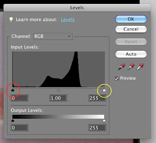
3. Press the COMMAND + L keys (Mac) or CTRL + L (Win) and the following histogram shows up. Very similar to your camera histogram. In iPhoto, click Edit your picture and click the Adjust Icon. For others, check for Levels help.

In this example, the photo has poor tonal range in both the shadows (to the left) and the highlights (to the right). This shape of the Histogram "mountain" tells us this. The picture will have a muddy quality to it. Using the controls it is easy to improve this picture.
1. Click and hold your left mouse button on the White Point slider, circled here in Yellow.
2. Drag it toward the left until it almost touches the "mountain" of the Histogram.
3. Repeat with the Black Point slider, circled here in Red.
4. Drag it toward the right until it almost touches the other side of the "mountain."
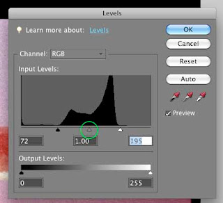
Your picture will appear "crisper"and the controls will be in their new positions as shown:

The last control is to adjust the center Gamma slider (or Contrast) circled in green. Click and hold and move to the left and right slightly to see the effect and leave it where you think best.
Save your picture when you are happy with the result.
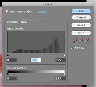
If you reopen the Levels tool, the changes to the histogram are evident showing a much better tonal range, one step closer to WOW! Once you are proficient with Levels, it will be time to explore the next step up in editing sophistication, the Curves Tool.

Subscribe to:
Posts (Atom)